Since I am a Industrial Design Engineering alumni I value well designed products and services. I will elaborate how I experienced using a MacBook Pro at university, and why this co-design of hardware and software proved to be a successful fit for me.
Hardware
During the first few months at university I realised how useful a Mac can be. Writing reports was actually fun for a change, compared to what I was used to on my Dell PC at home.
I noticed many of my fellow students using Windows laptops at times struggling to perform their work. Meanwhile I was not experiencing similar situations as much, if at all with my Mac.
For example, my MacBook was significantly lighter compared to the standard HP ProBook models many fellow students were carrying around. I heard many complaints about failing batteries, chargers or other hardware related issues, in the meantime my MacBook performed well.
There where downsides too, for example if I ever forgot my charger I had to go and hunt for another MacBook owner and ask if I could lend their charger for a moment due to the propetiary magsafe connector. Coming from a ‘normal’ windows based layout, the keyboard layout was weird at first but within a week I got used to it.
In my opinion do the downsides do not outweigh the benefits from using a MacBook over similar priced Windows laptops.
Software
This brings me to OSX Leopard. Before my Mac, I grew up using Windows 95 and later Windows XP on the desktop of my parents. When Microsoft introduced Windows Vista in november 2006, I could not get used to the redesign. Using Mac OSX was a breath of fresh air in comparison.
Usecase: productivity
Whenever I needed to get work done, the iWork suite worked very well for me. I wrote a significant amount of documentation about my projects, detailing every step and design decision. In design it helps to document your work if you want to be able to present your work months later. We worked in teams of four to five studens on a project for ten weeks.
Pages helped me out to be productive: I wrote my bachelor and master theses in Pages, both contained 90+ A4 pages and over 15.000 words. In industrial design you need to deliver reports with a nicely designed layout. Making well designed layouts in Pages is much easier compared to Microsoft Word, and requires a lower learning curve compared to Adobe InDesign for comparison.
Coming from Microsoft Word the ease of use inside iWork was a significant upgrade. The interface and features of Pages is exactly what I look for in a productivity application: a good balance between features and UI elements in logical positions. You only see the features you need, nothing more, nothing less.
Whenever I worked on a report by myself, I used Pages.
I loved to use iWork by myself, but in practice I could not work within a team without Office apps. Many projects had to be written together with a team of students and many of those worked on Windows based laptops, which are not able to run Pages. Luckily back in 2009 cloud solutions emerged, so we could work together via cloud apps such as Dropbox, which improved our workflows tremendously.
Eventually we discovered Google Docs with the useful feature of being able to work in one text document at the same time. Later I learned to use the Adobe CS suite of apps, such as Photoshop and Illustrator for my visual designs which luckily work both in Windows and on OSX. Being able to create visuals is an essential skill for a designer.
Later I did a year of graphical work as part of a study committee, which helped me to pick up skills with Adobe Illustrator, Photoshop and inDesign. We had to work inside SolidWorks. Sadly at the time SolidWorks worked only in Windows, installing a Windows partition was a requirement.
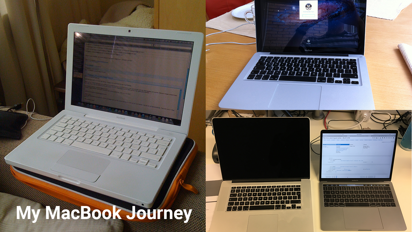
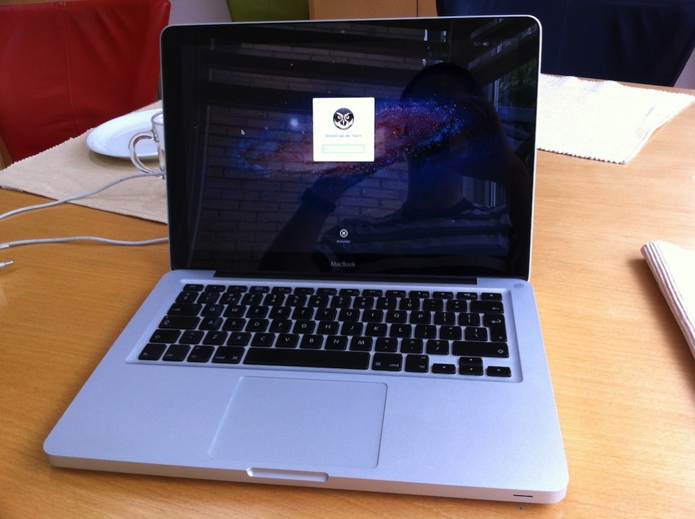
MacBook, late 2008, the first aluminium unibody model
When the white MacBook proved to be too slow for the heavy 3D design work, I upgraded to the unibody MacBook. I bought the MacBook second hand and eventually upgraded the RAM from 4 to 8 GB, and upgraded to a hybrid HDD with 8GB of SSD embedded on it.
I remember this MacBook fondly.
This Mac was a significant upgrade in '09, and was used 8 hours+ on a daily basis up until the summer of 2012. At the time I had a financial windfall, which enabled me to invest into a true pro laptop for my masters degree and beyond.
MacBook Pro 15” Retina, late 2012
During the introduction of the first retina MacBook Pro in the summer of 2012 I was blown away. I had saved up and it was time for an upgrade, which led me to check it out. I wanted to be prepared for my masters and afterwards. The retina screen was a significant upgrade over the built in screen in the MacBook I was using, and since I did lots of design and graphic work it was a perfect fit for my needs.
I know this is a hot topic nowadays with MacBooks, but for the time the first Retina was supplied with powerful components for it’s time. With a quadcore i7, 16 GB RAM, dedicated graphics card and a fast SSD this Mac still manages to be relevant today. It might surprise you, but I am writing this blog on the mentioned MacBook Pro at the moment!
This blog was part two of my MacBook Journey blog series. In the next part I will elaborate on how I work on a MacBook Pro Escape (13” late 2016 without touchbar) at work.
